One Covid chart to rule them all
Guest Post by Alex Berenson
Which Western country – and what strategy – worked best? (Spoiler alert: S—-n. And h–d i——y.)
Bloomberg recently published a fascinating chart showing how different countries handled the first two years of Covid.
Like most great data visualizations, it is simple and easy to understand once it’s explained. It focuses on OUTCOME, not process.
In other words, it doesn’t concern itself with how many vaccinations given or how many tests conducted or other numbers that matter mostly to the health bureaucrats who pay themselves to carry them out.
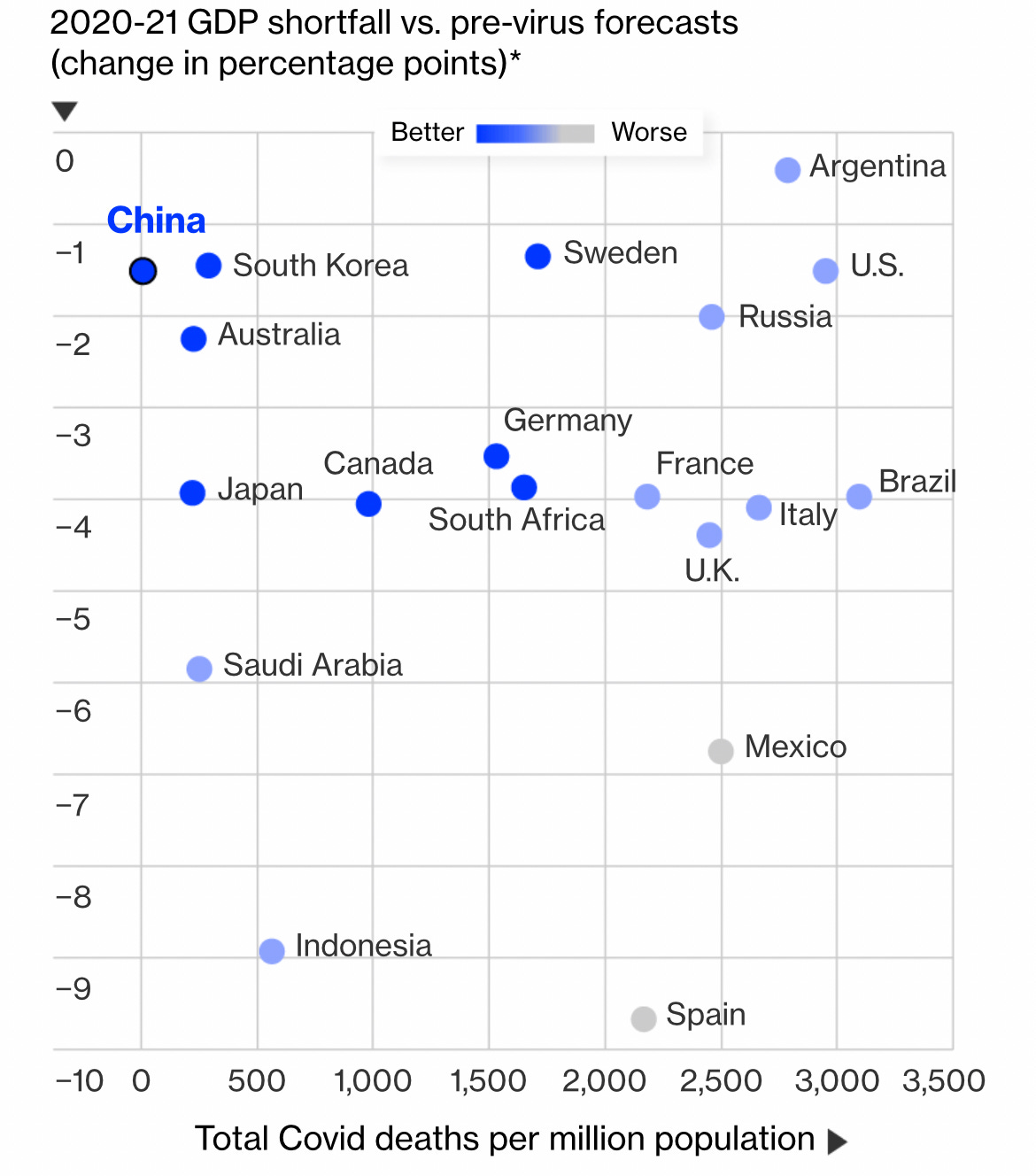
Instead it plots two variables: the number of Covid deaths, and Covid’s economic impact – as measured by how much economic growth fell short of forecasts in 2020 and 2021.
The chart is set up so that top left is better and bottom right is worse. Countries in the top left had few Covid deaths and relatively strong growth; those in the top right had lots of deaths and strong growth; those in the bottom left had few deaths but deep recessions; and those in the bottom right had lots of deaths AND deep economic pain.
Okay, here’s the chart:
—
The relative success of Asian and Pacific Rim countries jumps out first. For reasons that remain unclear, Asian countries reported far fewer Covid deaths than any others. Why? The answer doesn’t appear to be obviously demographic – whether they were young or old, rich or poor, they had fewer deaths.
Could the reason be cross-immunity? Some hidden genetic strength? (Asian-Americans have also had far lower death rates than other Americans, though higher rates than Asian nations.) Thinness? Some other factor?
The truth is we don’t know yet.
Also keep in mind that the lack of deaths didn’t necessarily translate into economic success, though – Japan and Indonesia, two of Asia’s most populous countries, both had severe recessions.
So geography – simple geography – appears at this point to be BY FAR the most important factor in how hard Covid hits a country.
Now try the chart again, this time without the Asian outliers.

Remember, top left is best, bottom right is worst.
Two points jump out. No major Western or South American country was even CLOSE to Asia. Look at those empty squares on the top left. And the United States is on the top right – lots of deaths, but minor economic impact. (Are you surprised?)
Meanwhile, big European countries like Britain and France – which took a national hard lockdown route – had nearly as many deaths as the United States but far worse economic pain. That’s particularly true of Spain, where lockdowns were brutal in 2020. (In general, Spanish-speaking countries had extremely poor outcomes despite extremely harsh lockdowns.)
But the country outside Asia that performed best? The one closest to the top left?
Sweden.
Yep, Sweden.
Lockdown-free Sweden, which trusted its people and refused to shut down and pursued a herd immunity strategy (without quite using that phrase) and became the subject of endless articles like this:

Two years ago, Anders Tegnell, Sweden’s state epidemiologist, said the world would need years to judge whether lockdowns worked.
And now, two years and one brilliant chart later, we have the answer.
They were worse than useless.
The corrupt establishment will do anything to suppress sites like the Burning Platform from revealing the truth. The corporate media does this by demonetizing sites like mine by blackballing the site from advertising revenue. If you get value from this site, please keep it running with a donation. [Burning Platform LLC – PO Box 1520 Kulpsville, PA 19443] or Paypal
—————————————————–
Use promo code ILMF2, and save up to 66% on all MyPillow purchases. (The Burning Platform benefits when you use this promo code.)

 that would be more powerfully connected to the technologically-generated electromagnetic ‘hive mind’ being constructed through 5G/6G towers and the constant proliferation of low-orbit satellites of billionaires like Musk")