New US Medicare data show COVID Vaccination INCREASES your risk of dying
The US Centres for Disease Control and Prevention (“CDC”) has always had access to Medicare records but has never made them publicly available. If the data supported the official narrative that covid injections are “safe,” the CDC would have made the data publicly available for anyone and everyone to analyse. Instead, the CDC hid the data from public view because Medicare records show the opposite – that covid “vaccines” are not safe.
The bottom line is, Steve Kirsch wrote, that when there is no data transparency, there is a high chance that the government is lying to you.
Let’s not lose touch…Your Government and Big Tech are actively trying to censor the information reported by The Exposé to serve their own needs. Subscribe now to make sure you receive the latest uncensored news in your inbox…
Medicare is a US government national health insurance program. It began in 1965 under the Social Security Administration (“SSA”) and is now administered by the Centres for Medicare and Medicaid Services (“CMS”). It primarily provides health insurance for Americans aged 65 and older, but also for some younger people with disability status as determined by the SSA, including people with end-stage renal disease and amyotrophic lateral sclerosis (ALS or Lou Gehrig’s disease).
On 25 February, Steve Kirsch was given an excel workbook with over 114,000 records of deaths by vaccination status from the Medicare database. He authenticated the data by matching it with records he already had in his possession. The newly acquired Medicare data shows:
- The vaccines are making it more likely that the elderly will die prematurely, not less likely.
- The risk of death remains elevated for an unknown period after being injected.
In short, the CDC lied to the American people about the safety of covid injections. They had access to this data the entire time and kept it hidden and said nothing.
In an article detailing his analysis of the newly received Medicare data, Kirsch wrote: “[In this article you’ll see] why the CDC will never release this data and why the mainstream press is NEVER EVER going to ask to see the data: because it would reveal they lied to people and killed over 500,000 Americans by recommending they take an unsafe ‘vaccine’.”
Both Dr. Clare Craig and Professor Norman Fenton have had a quick look at the Medicare data and, unlike data published by the UK’s Office for National Statistics, were unable to find any obvious flaws.
“Unless I made a serious error, there is no rock big enough for them to hide under on this one. No excuses. No attacks. It’s basically bulletproof. The results simply cannot be explained if the vaccines are safe. And the numbers are huge. You don’t need a peer-reviewed study on this one,” Kirsch wrote.
Note: Kirsch has excluded the unvaccinated from the charts he presents in his article to avoid confusion. The problem with the Medicare data, he said, is that the unvaccinated are a mix of people with vaccination and no vaccination so it is not pure. This is because Medicare patients went to a pharmacy to get their free injection and it wasn’t recorded in the Medicare records. This is why half the Medicare records don’t have any information regarding vaccination status at all. Also, people migrate from the unvaccinated group to the vaccinated group at an unknown rate, even Medicare doesn’t know the rate, which makes it problematic to use.
The records only show the vaccination status of people who have died rather than the full set of records that any truly honest government would supply. So, the data needs to be analysed in a certain way to understand what is going on. The data needs to be considered in terms of seasonality or deaths relating to seasons. For example, deaths increase during the winter season and then decrease again. “The drop could be as much as 40% from the peak value [of covid deaths plus season deaths],” Kirsch noted.
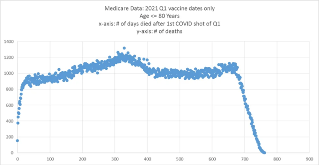
Using data for vaccine recipients only Kirsch explained: “If the vaccine is PERFECT, we’ll see the [post-season] slope [of days to death] go down, but not as much [as 40%] because we’ll just see seasonality effects going down (since nobody is dying from covid) … If the vaccine isn’t causing harm, the slope will go down and remain flat.”
Kirsch used the Medicare data to calculate the number of days to death after the first dose was administered. Looking at the pre-covid era data for the elderly, Kirsch found a strong seasonality of deaths. They are high in the winter and low in the summer. The difference between peaks and troughs is around 20%. This data is from the CDC for ages 65-84:

The covid vaccine program was initiated on 14 Dec 2020 and peaked in the third week of Jan 2021 for people in the 65-84 age group. By honing in on the days to death data for the period beginning when the first dose was administered in Q1 of 2021, “if the shot is harmless, we should see the rate of deaths dropping for at least 9 weeks after the shot, and then remaining flat for the next 15 weeks before turning upward,” Kirsch explained.
But the data shows the slope goes up instead of down.

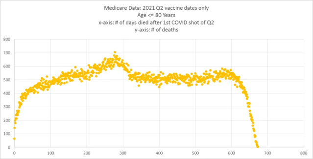
The same is seen for those who received their first dose in Q2 of 2021. “The slope should be flat for around the first 15 weeks after the shot is given (we are starting in a [seasonally] flat period, week 13) and we have about 15 weeks of flat deaths after that. Yet the slope is going up when it is supposed to be flat,” Kirsch said.

Using charts to demonstrate, Kirsch shows how the same problem happens with the second and third doses. “[The data for dose 3] suggests that if you lived until shot #3, it will still increase your risk of dying, just not as much as the earlier shots,” Kirsch said. This “just not as much as earlier shots” conclusion is based on the same number of people receiving a second dose as received a third dose. The elevated risk of dying is also seen after receiving the fourth dose.
When Kirsch factored into his calculations that fewer than half the people who received a second dose received any boosters (68% vs. 33%), in the first 200 days post-injection there was a 50% increase in the rate of death (600 per day) vs. the 400 per day rate after 1 year.
“The good news here is that it shows if you stop the shots, it appears your risk lowers after a year,” Kirsch said.
You can read Steve Kirsch’s full article ‘Medicare data shows the COVID vaccines increase your risk of dying’ HERE. His article ends with a section for analyses done on different data by other researchers which also conclude that the covid injections are deadly. The resources Kirsch refers to include:
- UK ONS Updates English Dataset after 1 day, US Mortality, 22 February 2023
- The latest UK data is still DEEPLY flawed, Steve Kirsch, 23 February 2023
- Twitter thread by Ethical Skeptic, The more a state vaccinates, the greater the number of covid deaths, 26 February 2023
- Book by Edward Dowd, “Cause Unknown”: The Epidemic of Sudden Deaths in 2021 & 2022 (Children’s Health Defense)
- The role of social circle COVID-19 illness and vaccination experiences in covid-19 vaccination decisions: an online survey of the United States population, Mark Skidmore, 24 January 2023
- Video: Steve Kirsch interview with Mark Skidmore, Mark Skidmore wrote a paper that goes against the mainstream narrative, 2 February 2023


